
Project information
- Category: Layout
- Project date: December, 2023
Futura Type Magazine Spread
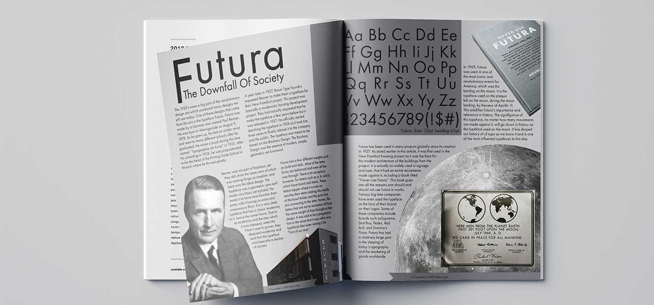
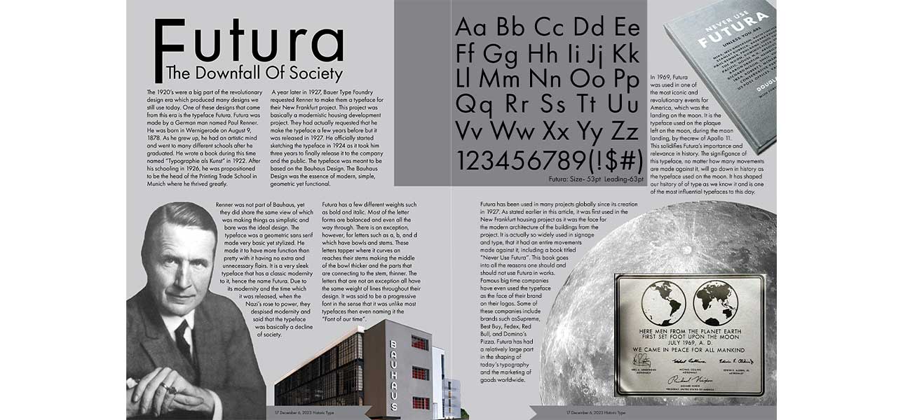
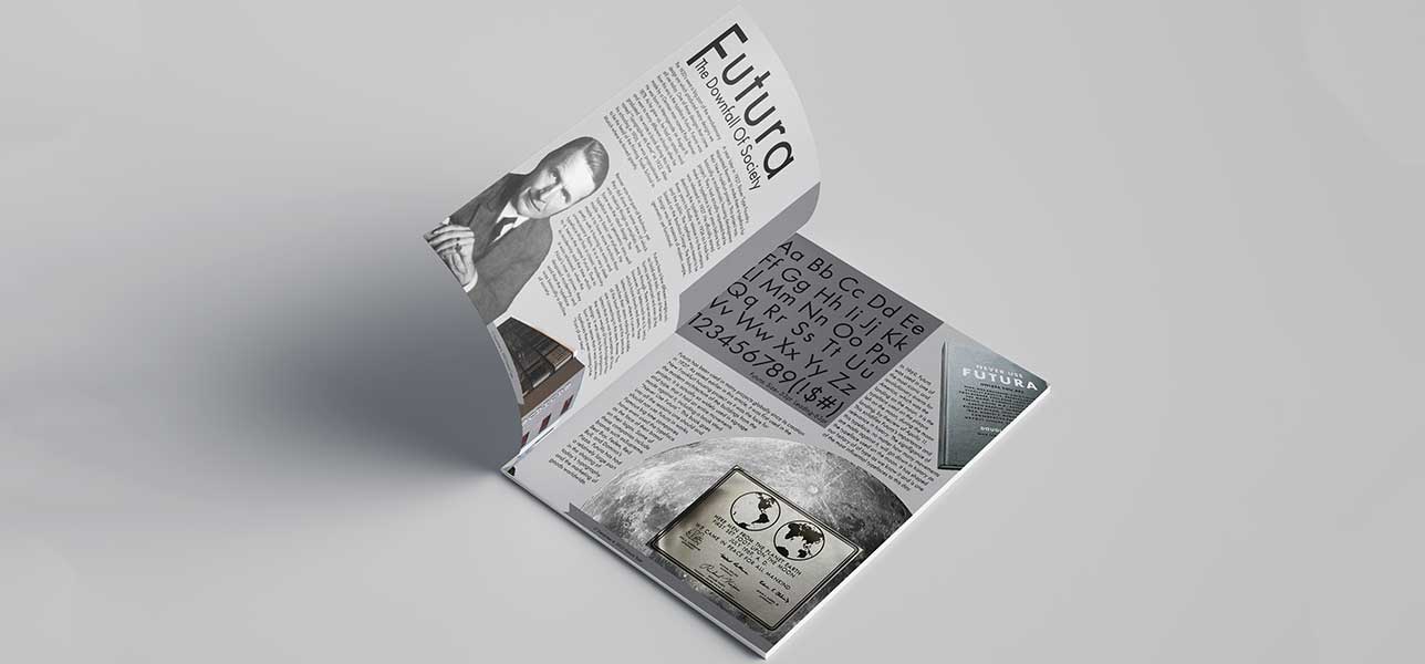
A typeface was chosen at random to make a magazine spread for and Futura was drawn. A look into how magazine spreads are normally layed out was conducted by going and finding various magazines in store to observe. After bringing them back to the workstation, a few spreads were disected and broken down into measurements of margins and sections making a grid. The formatting was broken down to better see how excactly this spread should be laid out. After getting the measurements of the margins down and planning the layout, a file in Adobe Illustrator was created and the making of the spread began.
Since it was an older typeface, most of the pictures of the creator were in black and white or greyscale. Futura was also the typeface used on the plaque on the moon which when thinking of the moon’s color pallet, is greyscale. Many other picture elements that were going to be used just so happen to also be grey giving the spread the color pallet a monochromatic color scheme of black, white, and grey. The title of the spread came from an article that was written about Futura and what the Nazis said about it being the downfall of society as they despised modernity. The image elements of the spread were edited in Photoshop to be cut out and stand-alone without a background. The images were then put into Illustrator and the words were fit alongside them to flow around the images.